leaving the “shouty, big numbers about nonsense topics” behind us…
Knowledge, isn’t an “ah ha” moment or eureka exclaiming euphoria. It’s a process of building on the thoughts, on the imaginations, and connecting with the historical musings of others. Straight lines or specific points aren’t the paths or places that get us to saying with absolute certainty, “I know all about this discipline or everything about that school of thought.” Getting to know is more like revelling in the wanders through our minds maze. There’s wonder in gathering and connecting ideas.
I know some stuff about visualizing data and information. But, everyday’s a humbling reminder of how much I don’t know. Visualising Data is a spark of imagination that helps me see information as meaningful beyond the written form. Hearing Andy Kirk speak on the subject, and subsequently connecting with with him in person has meant a lot.
Andy kindly included me in one his series of short articles titled ‘six questions with…’. It’s a pleasure share some of his thoughts. Here’s my three questions with Andy Kirk.
1) Since 2007 what’s happened (trend or event) in the data visualization world that’s surprised you the most? And subsequently, what trend or event unfolded in a manner close to what you may have predicted? The retrospective crystal ball moment 🙂
“When I discovered the data visualisation world in 2007 one of my initial predictions was that by now (2016) we would have specialist people in organisations of all shape and size whose job title would be quite explicitly dedicated to being a ‘data visualisation’ professional. What has happened instead, in my view, is that data visualisation capabilities are increasingly being absorbed my a broader range of people alongside their other duties. I feel it is becoming an expected part of the contemporary professional’s skill-set, given that working with and communicating with data is becoming ever more ubiquitous.
I suppose the only positive prediction I would have made that has materialized is simply that visualisation is not and will not be a passing fad. Some practices will come and go, tools will evolve but the underlying need for visualisation has and will be sustained.”
2) In the last year or two, what data visualization project (or projects) have you seen with the most impactful human qualities about them? Where you’d not only say Wow! But, you’d more importantly say, “I didn’t know that, but it’s sure something as a society we need to know about and take action on.”
“This is a hard question to answer simply because I have the curse of being unable to switch off my lens as a visualisation designer and educator. When I see a visualisation project I find it nearly impossible to ‘just’ be a reader or consumer, instead I immediately start to forensically dissect the design and analytical choices I see — what charts they’ve used, how they’ve combined colours, what architectural composition they’ve employed…
That said, the two projects that stand out as immediately resonating with me on the simple basis as a reader were — ”
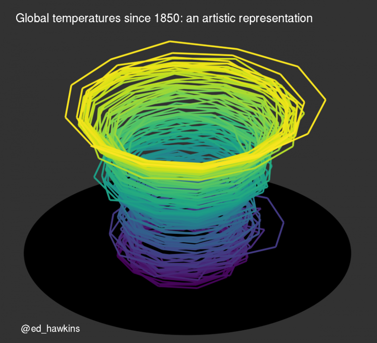
Climate Spirals — portraying quite profoundly the story of temperature changes.
And this…….
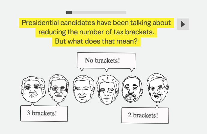
100 years of tax brackets — which in my interpretation portrays a proxy story of the rise of wealth inequality.
3) Looking into your crystal ball. What’s the one trend in data visualization you’d like to see become a thing of the past (not good for us)? Why? Turn that around, what’s one trend we’re not collectively talking about today, that one day we’ll be saying… this is a difference maker?
“I think we’re starting to see the decline of the trashy infographic — the 600px wide, 100000px long tower posters. These aren’t infographics in their purest sense, rather they tend to portray shouty, big numbers about nonsense topics with little or no demonstration of good visualisation principles. Probably between 2010 and 2014 it was at a peak and arguably damaged the ‘brand’ of the craft of infographic design. Thankfully I’ve seen a steady reduction in these types of work.
I think the biggest trend that will be a difference maker IS actually being talked about (so not answering the question!) but is something I feel has only come to the surface this year — that is the movement towards placing more emphasis on explanatory visualisations than interactive exploratory ones. Archie Tse of the New York Times discussed this at Malofiej conference — its about demonstrating ever more discerning judgment towards the value of the clicks/taps you task your audience with. It is about removing the gratuitous and unnecessary obstacles towards understanding, taking more responsibility to impart that understanding rather than leave it to readers/users to find themselves.”
_________________________________________________________________
Think about adding Andy’s book Data Visualisation to your reading list.
From the pen of John (cofounder)
Please visit Mentionmapp today!
