Every month, with clockwork like precision a brown paper package arrives in the mail. The unwrapping is revealing. For almost 50 years the National Geographic has been enriching my imagination. The connectedness to ourselves, to our planet and cosmos is like a lattice of human context. It’s also an important source for our visual and aesthetic literacy. I see our graphically visual world as distinctly human, whereas raw data points have no human essence. There should be no mistaking data for knowledge.
Big Data, and data visualization are important topics. But it’s troubling when they’re stories reduced to little more than ill-defined link bait. Accepting there’s also no unified theory or singular definitions for either data or it’s visualization is important too. We can discern between structured (bits of ledger) and unstructured data (streams of social chatter), but data itself is simply the columns and rows fodder. It’s the slices of pie in that fill a chart. Spreadsheets and pie charts are meaningless artifacts. It’s the art of asking questions that brings them to life. Transforming crumbs of data into information, in turn gets us to the possibility of knowing.

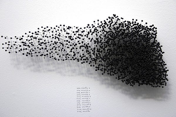
Without structure, data doesn’t become knowledge. It’s like looking into a murky swamp and trying to understand the dividing properties of an amoeba. Try viewing it in a petri dish instead. Appreciating when there’s no structure, there’s no meaning attracted me to Manual Lima’s book Visual Complexity. It’s influenced my appreciation of visual literacy. It was also cool seeing Mentionmapp on page 153.
With a historical context and framework of techniques and best practices, Visual Complexity also help me discover other visualization leaders (who we’ll write about in future posts). Lima’s depiction of the visualize network being “the syntax of a new language,” made an impression. Knowing that sight is the translational interface between a visual object and a textual relationship, was my… “ahhh, that’s it moment.”
When data intersects with visual science, there needs to be an aesthetic anchoring for knowledge to surface. There has to be an art to the science. Lima shares this Matt Woolman quote; “functional visualizations are more than statistical analyses and computation algorithms. They must make sense to the users and require a visual language systems that uses colour, shape, line, hierarchy, and composition to communicate clearly and appropriately, much like the alphabetic and character based languages used worldwide between humans.”
From his TED2015 talk Lima says, “we can see this shift from trees into networks in many domains of knowledge. This metaphor of the network, is really already adopting various shapes and forms, and it’s almost becoming a growing visual taxonomy.”
Watch Manuel Lima: A visual history of human knowledge
Using data and revealing a world of stories is an art. I’m appreciative of how Lima communicates the aesthetic value of visualization. Turning the complex and the chaotic into meaningful social, political, economic, and human insights is essential. We can’t get so lost in the science of data that we forget the importance of allowing our eyes, and allowing ourselves to both revel in it, and to discover knowledge in the art of data.
From the pen of John (cofounder)
Please visit Mentionmapp today!